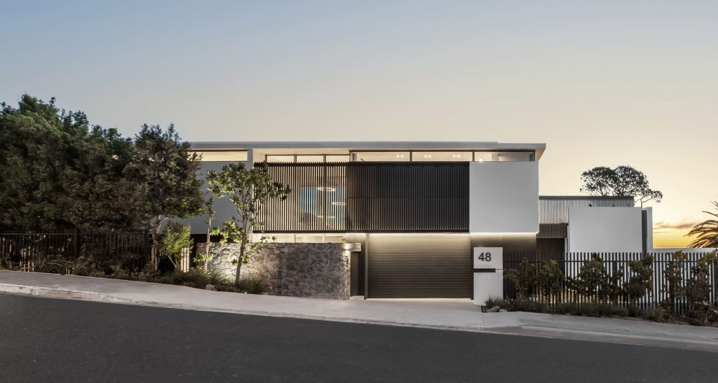
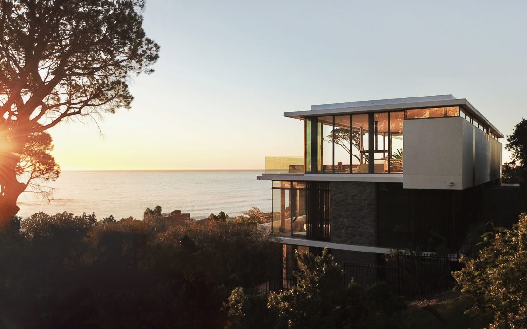
Up close with three design strategies that follow through every detail: durability, minimalism and practicality, the purpose of this project was to design large enough to accommodate an extended family from both the US and Germany. The original 1980’s structure functioned as an artist’s home and her art gallery. It was demolished with as much vegetation as possible retained.
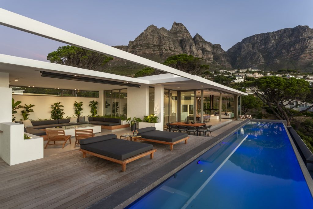
This single volumetric structure floats above the street level from a long and narrow site where the property steps down the steep western slope in a linear form. Having been built into the embankment means the home’s ground floor hallway is effectively underground and the first storey entrance ties up with the street level.
Uncomplicated straight planes and integrated courtyard spaces allow for privacy from the street and provide protection against the south-easterly wind. This wind is known as the Cape Doctor because of a local belief that it clears Cape Town of pollution and pestilence. This strong, often persistent, and dry wind blows on the South African coast from spring to late summer.
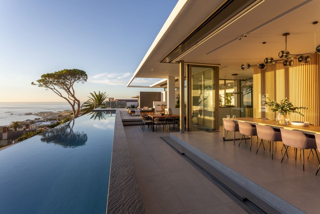
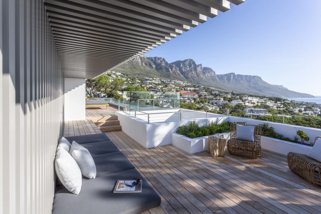
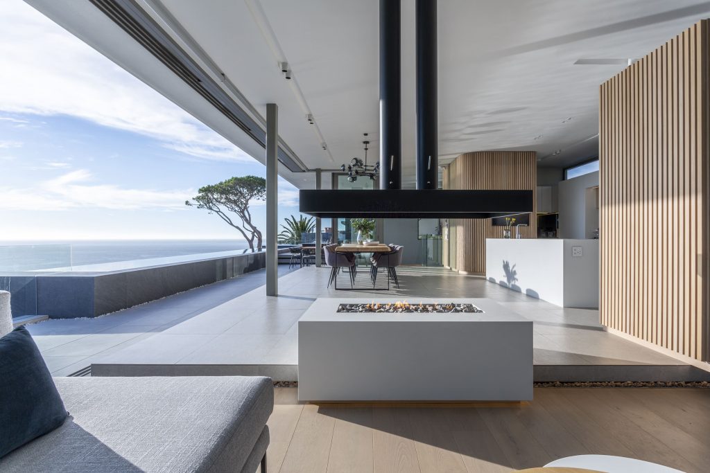
The house orientates towards the ocean to maximise on views, but also slightly angles its back against the Cape Doctor.
All bedrooms and living areas have views over the ocean, while service areas like passages, walk-in cupboards and en-suites are allocated to the road-facing façade of the building. The six bedrooms are all en-suite. Included is one staff quarter with two bedrooms. The pyjama lounge can be converted to additional sleeping space if required.
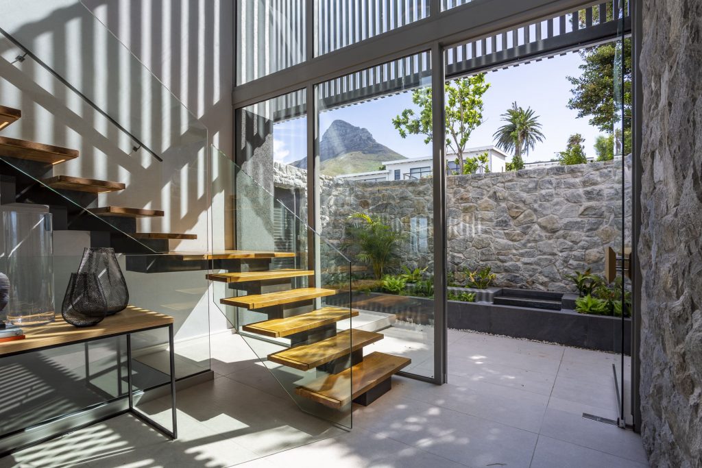
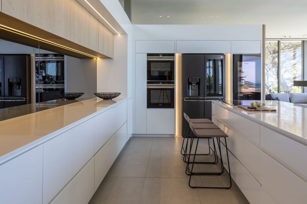
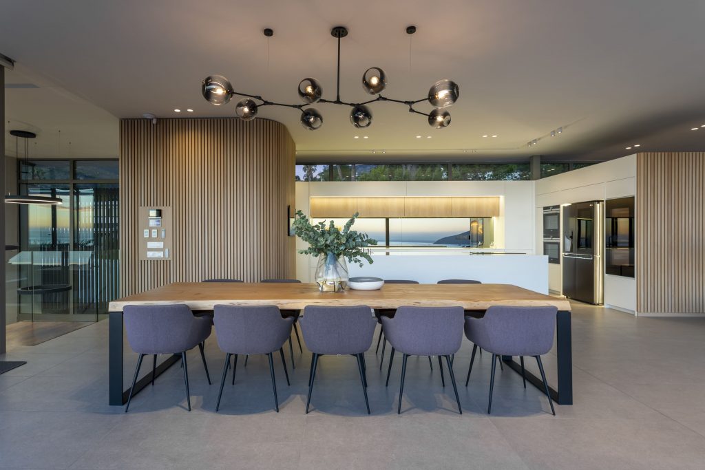
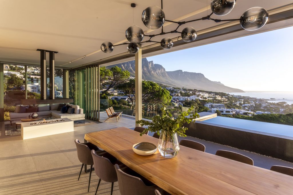
The overall objective was to allow maximum flexibility in the way the owners can use the house: it needed to feel large enough to have multiple members of one another’s families visiting, without feeling congested; yet small enough to feel intimate should it just be the two owners occupying the house.
A need for maximum privacy – and a request to maximise the views – informed the creation of various spaces: such as courtyards and decks where owners and visitors can escape to appreciate the prime location’s landscape views.
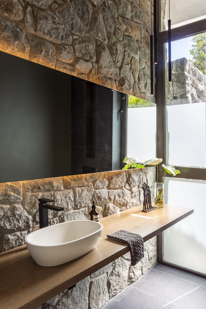
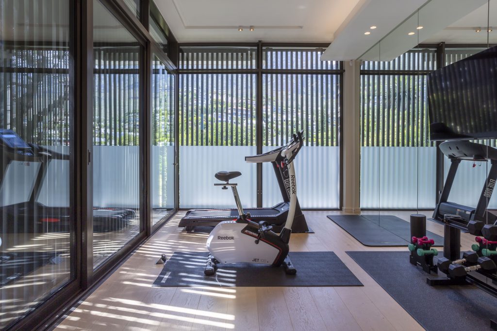
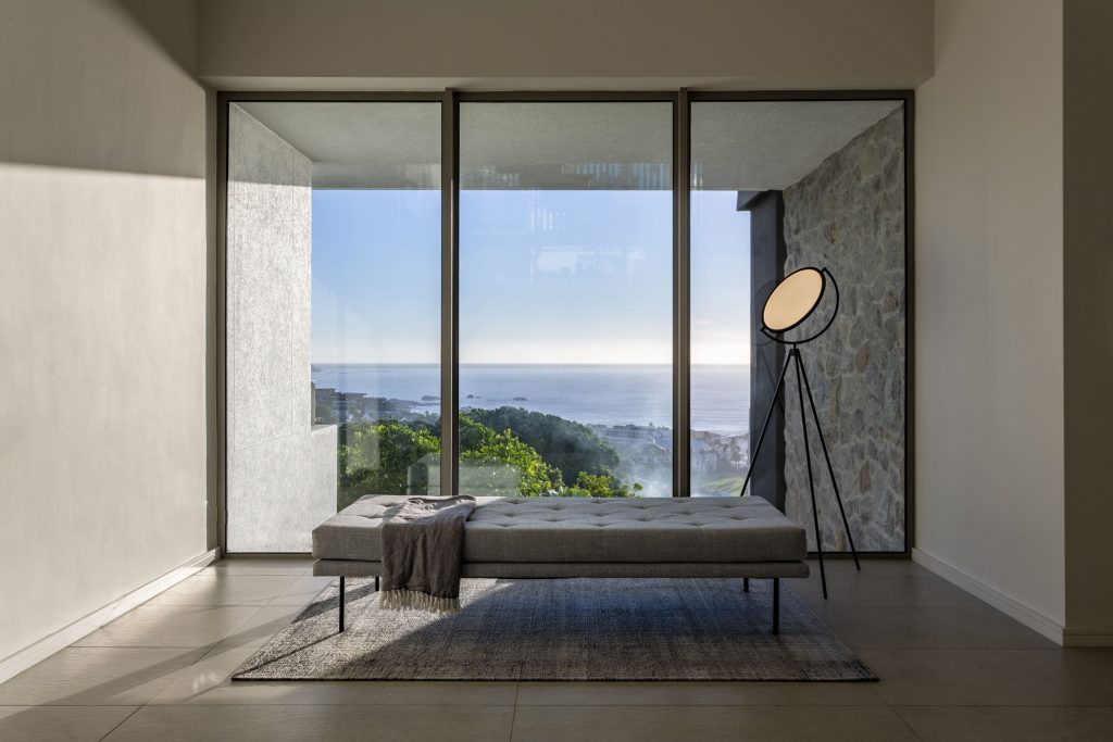
Due to the site’s shape, the architects had to carefully consider ways in which to avoid redundant circulation. The architecture practice and interior design studio GSQUARED overcame this challenge by creating areas that would normally be seen as a passage to pause, sit and frame certain views. Clever screening and architectural features were used to hide the street.
Architects add: ‘One of our favourite spaces in the house is the yoga deck screened by a custom-made aluminium frame and surrounded by planters.’
The clients were totally invested in a 18m long heated lap pool with seating on the top floor. This posed a challenge, not only architecturally but also structurally. GSQUARED had to accommodate thicker than usual concrete slabs, ceiling voids for services below the swimming pool, while maximising floor-to-ceiling heights in each room.
The 12m-long swimming pool with infinity edge on the top floor seamlessly brings the ocean right to the entertainment space – a feature that takes centre stage at sunset.
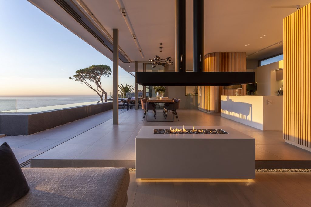
‘The gym and sauna both frame views of Table Mountain. You can sometimes see the cable car go up and down the mountain. The formal lounge has a fireplace, which separates the dining room from the living room and creates a beautiful atmosphere at night. The main en-suite with its own fireplace and jet bath feels a bit like an isolated Camps Bay pavilion with maximum benefit of views, yet in absolute privacy.’
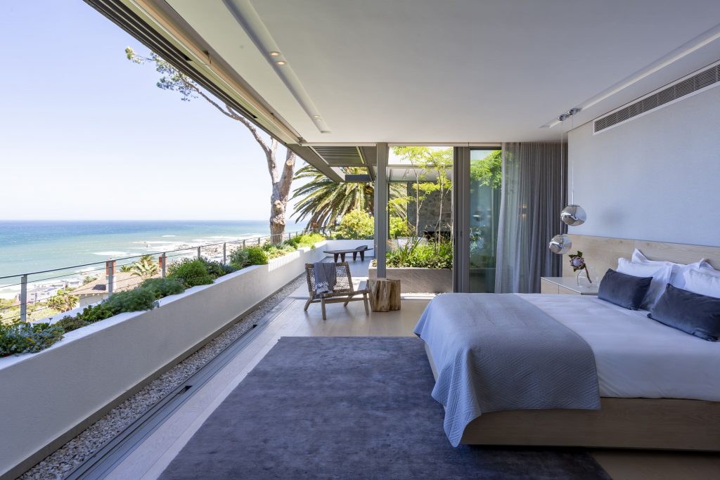
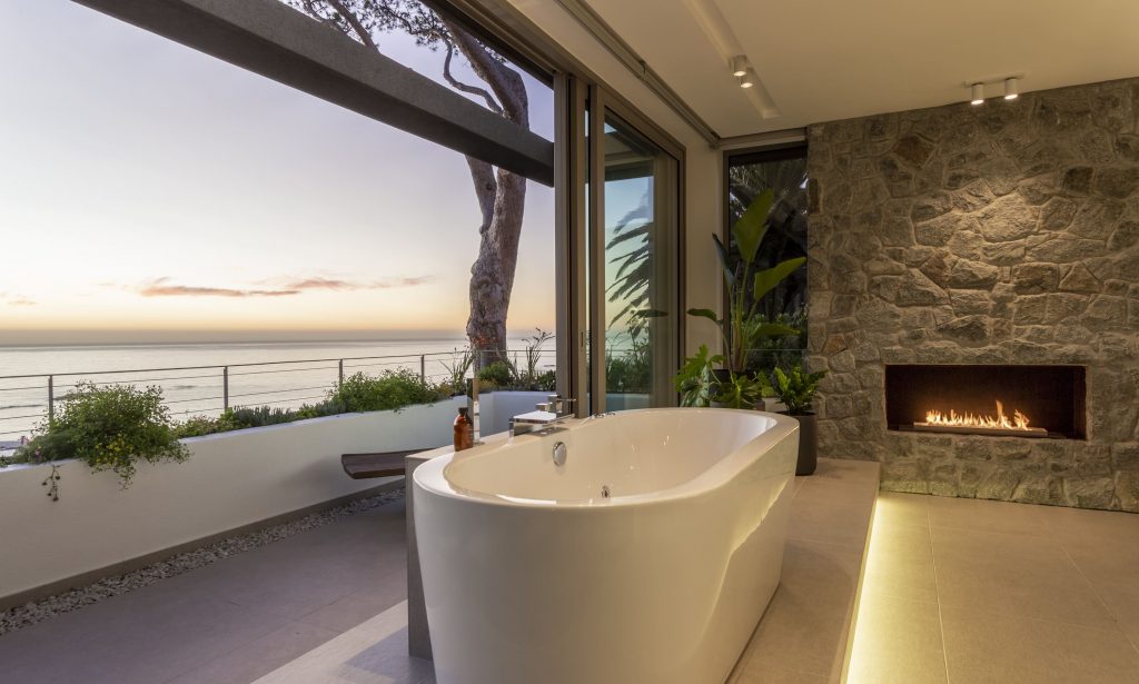
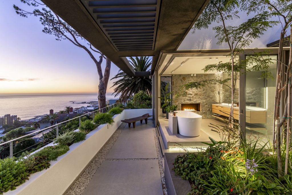
‘The house is fully equipped with solar panels and back-up battery power. Some appliances and amenities such as the sauna, stove and pool pumps – do not operate on the battery backup. State-of-the-art alarm system and CCTV were installed throughout.
‘The clients are very happy with the result and often send messages to tell us how much they miss their home in Cape Town while they’re travelling. They had their first December holiday in the house and thoroughly enjoyed it.
‘The clients are still in the process of finishing off the interiors and will collect art as the house requires and while abroad, the owners rent it out. The project started in 2018 with design concept and council permission. Upon approval the site was handed over to a main contractor in October 2019. As from March 2020 the project was suspended for a few months due to the COVID-19 Lockdown Government Regulations. The project was completed end of 2021.’
habitat: In your opinion, what idea is shaping design and architecture today? Please unpack…
GSQUARED: The idea of living in a square or rectangular space is being softened by curves and arches. You can see it in the latest fashion, furniture, product, interior and architectural trends. We’re exploring some elements of the Art Deco era, but in the same breath having a very firm understanding of the impact our products and designs have on the environment. We’re looking at low maintenance, natural, raw materials that have not gone through vigorous chemical processes; materials that are locally sources and understood by the local tradesmen to build or to install.
h: What aspect or feature of a building or of architecture and design do you most enjoy reinterpreting for the 21st century and why?
GSQUARED: We’ve always focused our approach on simplicity and minimalist designs. We strongly consider the elements of nature and provide protection against these. When inside, this journey continues through circulation spaces, framing views and leading the visitor to adjacent spaces, whether public or private. The placement and flow of function between spaces, while optimising volumes, sparks joy when designing. Having natural direct sunlight filtered through screening devices allows these volumes to change during the day. So, light-filled circulation or living rooms never really appear the same as the day changes nor as seasons come and go. In the 21st century, it’s important to make use of technology, but we must harvest what we can from site and daylight is a free resource. It can bring warmth to a building, and if shaded correctly allows indirect natural light into spaces.
h: What kind of client characteristics are ideal during project phases? i.e. the richest kind of rapport between client and architect.
GSQUARED: Clients usually understand spaces without knowing how to express or draw them. This skill is what we would call vernacular architecture. We all have it. The difference is architects are taught how to formalise these ideas, materials, shapes and forms into structures, houses and buildings. We find out clients’ trust to be the highest valued commodity when it comes to characteristics. We build a long relationship with our clients while they invest in our ideas, skills and dreams. As the client should trust their architect so should the architect trust their client. When this relationship exists, it’s easy to share practical ideas, ideals and outrageous thoughts. It’s only when you trust your client that you can be totally honest in your design. Then it’s all about the clarity of you communication in showing your client what really makes you happy. A lack in trust may lead to these enlightened spaces being lost in translation.
h: What statement is residential architecture making about our world and its people today? What fascinates you most these days?
GSQUARED: Residential architecture, whether a large mansion or small intimate house, has one purpose: to protect us from the natural elements. This is the reason architecture and building exist. What amenities you add to this protected shell is directly equal to wealth. Not only financial wealth, but whatever you consider as valuable. It is the ensemble of these features that makes our homes individual and unique.
GSQUARED has been entrusted with some of the most incredible sites in and around the Atlantic Seaboard in Cape Town. The practice has created buildings in Europe (Belgium, Netherlands), Africa (Lagos, Gaborone, Namibia, Mozambique), as well as in some of the most remote parts of the world (islands in the Atlantic). Due to Non-Disclosure Agreements GSQUARED is not legally free to show off and share. They aim to complete more projects in Europe and the Americas.
Flooring: Vintage Projects | Joinery: MALCO | Landscaping: BEST LANDSCAPING – Julien Bartels | Kitchen by: MALCO | Bathroom/s by: MALCO, Exquisite Bathrooms, Plumbing World and LAVO Bathrooms | Fireplaces by: Beauty Fires | Marble / granite tops by: Granite Projects via MALCO | Shutters by: Aluvent | Aluminium Windows and Doors: Glassmen Retreat | Lighting: Light by Linea | Exposed Aggregate driveway and stepping stones: Inova Worx | Steel and timber stair: DSI Steel | Solar Installation: Blue Sun Energy | Electronics: Digital Fortress | HVAC: Airvent Airconditioning | Swimming Pool: Anthony Pools | Shower Glass: Glass Benders | Sauna: Wellness Fitness Africa | Hot Water Generation: Red Label Energy | Metal Work: Sola Metal Fabricators
location: Camps Bay, Cape Town, South Africa | project name: S-48 | size: undercover: 858 sq metres / property total: 962 sq metres | interior architecture by GSQUARED; furnishings by client | architecture: GSQUARED Architects & Interiors | project team: Renato Graca; Francois du Plessis; Rene Baker | photography: Niel Vosloo
