Smac Studio and Van Rooijen Meyers Architects combine to craft a home of considered detail and refinement, capturing the personalities of those who live there. This is the third project that SMAC Studios and client have worked on together and is a double-storey duplex home for a family of four and soon-to-be five on the way. You’ll find conceptual consistency throughout.
Shona McElroy, principal of Smac Studios, elaborates here about project Mirror Image in Sydney, Australia, which was recently shortlisted for an Australian Interior Design Award. ‘The client wanted it to look like it came out of a magazine. With two and a half bathrooms, four bedrooms, one car garage, two living rooms and a swimming pool pool in the pipeline, it needed to be an impressive entertainer’s house with the wow factor in the limelight. That was the brief Shona received. Beyond that, the clients left it pretty much up to her. She adds: ‘They knew my style, and that I love modern takes on ancient European styles. I started participating before the development application was submitted, which meant that we were able to manipulate many spaces and setbacks e.g. to increase window sizes that look out on the landscape.’
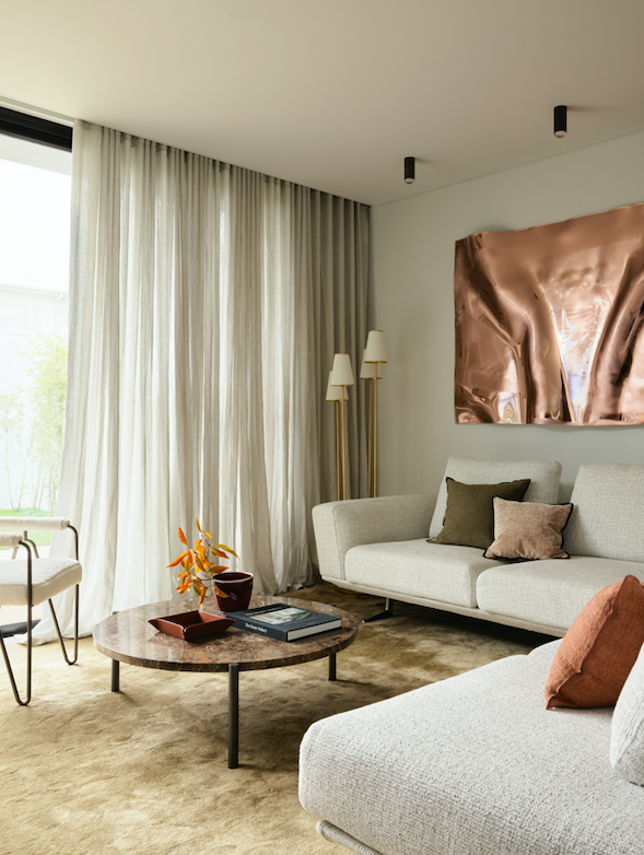
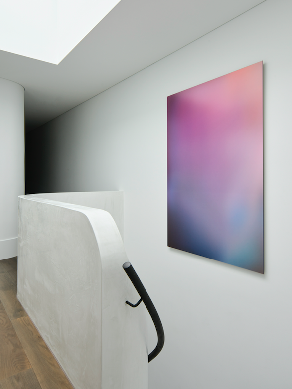
Artwork: Commission by Anya Pesce via M Contemporary
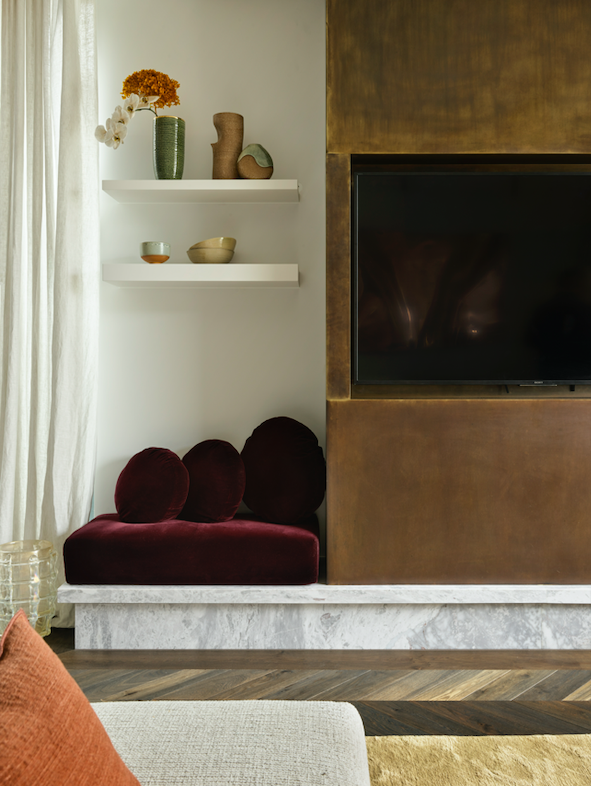
The Venetian plaster, the margin shaker profile, the chevron floors, the borders and the curves are design details that nod to the European, but the clean lines and layout modernise the overall feel that’s further enriched by layers of contrasting materials.
The SMAC team only had 4,8 metres of internal width to play with in order to create a formalised entrance that separated public from private spaces –an incredible thing to have achieved so successfully. Shona says: ‘It’s my favourite space in the house. I find it quite luxurious to walk through this marble forecourt from your entertaining spaces, the big kitchen, living dining and external area.’
Comment from Gary Meyers, co-founder at VRM Architects: ‘There was an exceptional amount of design and space planning to configure to maximise the small site. I spoke personally with the adjacent neighbours before the DA was lodged, which in most cases assists my clients in ensuring we have a friendly environment within which to work once approved. The entire project took countless hours of making changes. We enjoyed working with Shona and we are now working together on another two homes. The architectural design skill required to make the spaces functional was challenging, but that’s when we perform best.
‘Vale Adam Lowick was the site supervisor for Mirror Image. I worked with Adam for over 20 years and he was extremely competent at everything he did, as well as being the life of any party. He sadly passed away in his sleep near the conclusion of the project and will be missed by so many.’
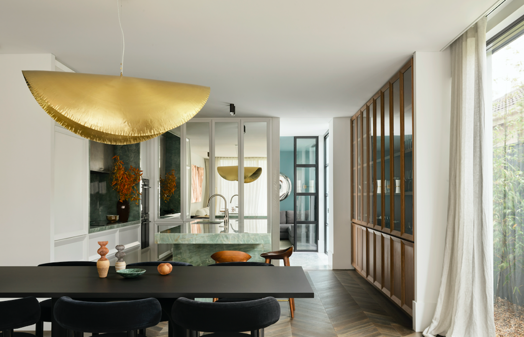
The main challenge from the outset was natural light; and Shona felt the spaces were too open plan and lacked formality. This was solved by dividing up the entrance. The next question was the narrowness of the space and visually dividing the living and dining spaces so that they all felt special was a challenge. The big Gervasoni pendant light and the artwork ground each area so that each owns in its own space. The kitchen’s beautiful mirrors hide all the joinery and reflect the gorgeous northern garden light.
Shona says: ‘I believe the lights are not lights. They embellish the home as literal art forms. They’re stunning.’
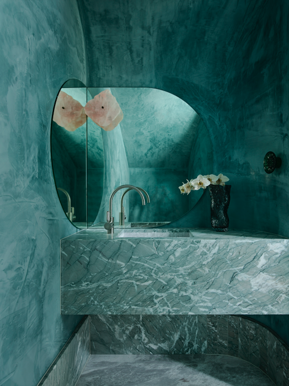
And she continues to admit: ‘Another challenge we had, which turned out to be – as it often does – our greatest achievement, was the little powder room. We really didn’t want it to feel like it had been stuck underneath the staircase, but inevitably that’s where we had to put it. So, we ended up relieving all of those staircase lines. You can see the staircase goes up the back because it’s got a piece of plywood curved over the entire roof. In both the staircase ending and connecting lines, concrete was hidden and therefore it’s like you’re encapsulated in a big dark green Venetian plaster cave. No ceiling wall lines are visible. It feels like a cave of treasures with all that marble and rose quartz and all that lovely, moody dark colour and curves. Says Shona: ‘Yes, we leaned straight into the fact that it was going to be an encapsulating space. That’s why we did the dark, tactile plaster.’
It looks like the staircase is built for that sculpture and for that Christopher Boots light. The staircase was originally running against the shared party wall, with it facing the party wall. That’s the way a lot of duplexes are designed. You’re essentially in the kitchen facing the staircase, and that leads up to the hall and the bedroom. To avoid this, SMAC had to reconfigure the entire upstairs.
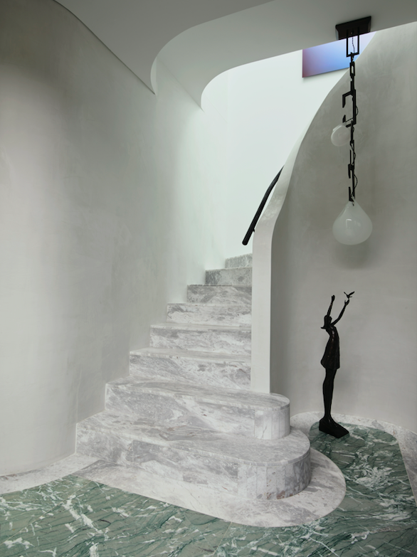
Light: Nepenthes by Christopher Boots via Est | Statue: Bronze
statue Aurora IV by Tom Corbin @studiocavit | Artwork
(up stairs): Paul Snell via Studio Gallery Group
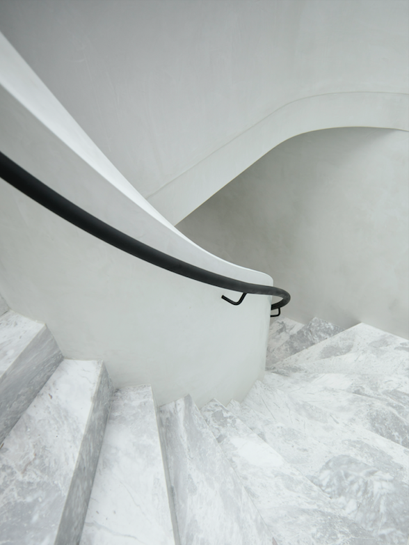
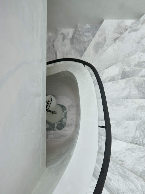
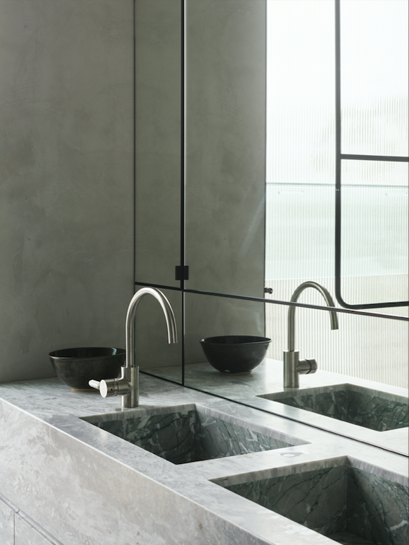
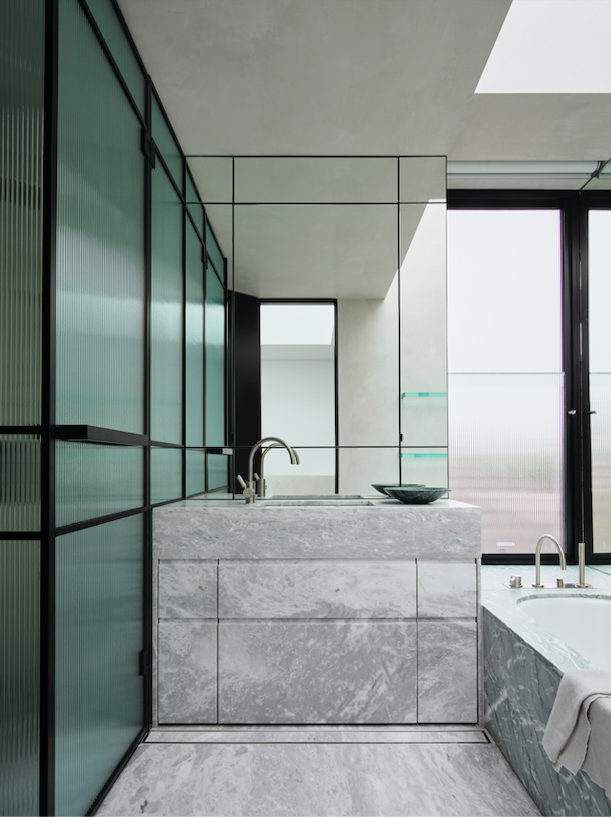
Outstanding features in the interior design emphasise the level of detail that SMAC focuses on. Subtle links throughout the house tie it together, even though the rooms are quite different. E.g. the powder room and the upstairs bathrooms communicate connection by being equal opposites of each other: the upstairs bathrooms have Elba marble vanities with Verda Antigua green stone sinks and the powder room has Verda Antigua green stone vanities with Elba marble sinks. Throughout the home, the floor’s chevron pattern is boarded by straight panels, which is replicated in the entry with the exact same marble thickness – but in a contrasting marble.
The pendant in the entrance is an art form, and the pink metallic artwork in the living room by Anya Pesce is a two-metre-long sculptural piece that produces the same reflective qualities as the house’s.
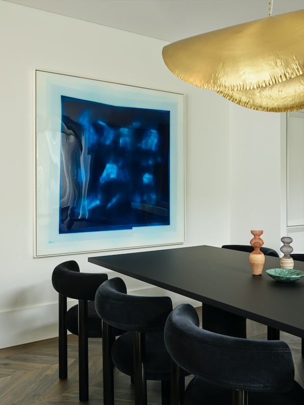
A Rick Carlino piece in the dining room makes you feel like you’re underwater. Up the stairs, a Paul Snell piece’s remarkable quality is that the colours seem to change as you walk around it. Art becomes the crown jewel of the house.
Light: Petra Sconce in Pink Onyx by Christopher Boots via Est
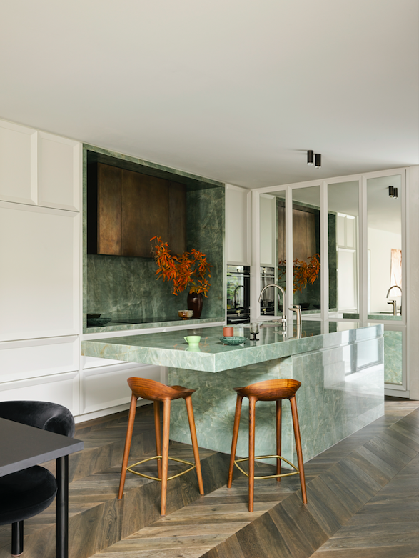
‘One of the clients is a great cook. Sitting up at the kitchen island, I’d sip wine while she prepared dinner,’ Shona adds. ‘The kitchen sink was built into the island where the kids would always put their bowls and her back would face me most of the time as she’d turn to the stove. This mess frustrated me. We put the cooktop in the island with a downdraft and a second sink and only dishwasher in the Butler’s Pantry. The owner even confessed to hating it when people think they need to clean up at dinner parties. Now everyone chucks their plates in there, she shuts the door, and everyone forgets about it and can go on having a fabulous night.’
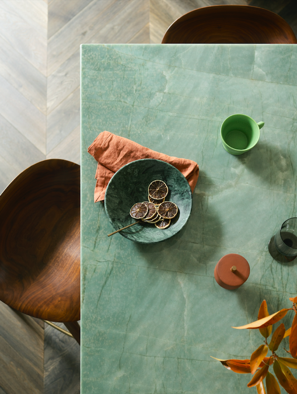
There is a big steel support through the cantilever on the island and a 10cm-thick bench top. The designers created a shadow line that disconnects it from its really solid base so that one half is solid with a big canter over towards the dining area. SMAC wanted people to sit. ‘It’s important to make spaces conversational,’ Shona says.
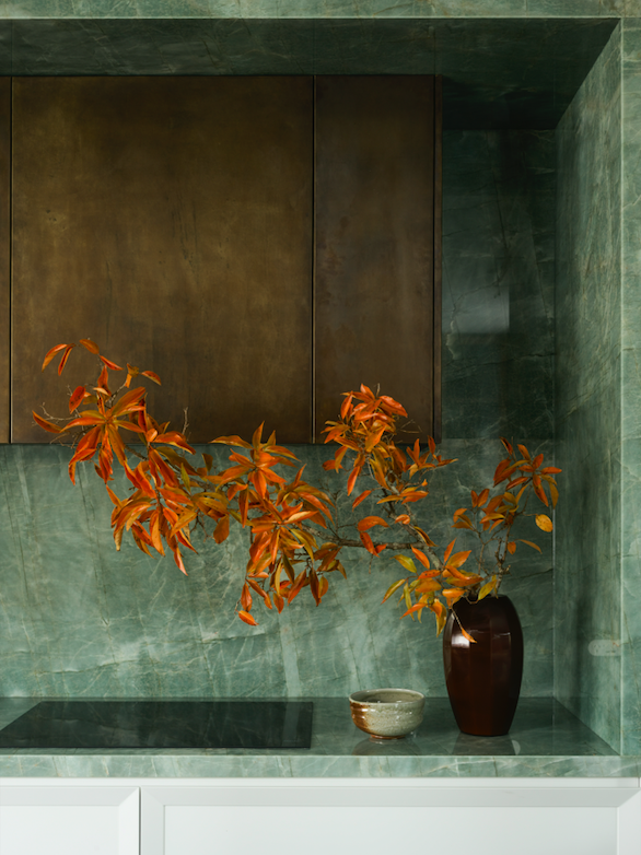
‘The green stone in the kitchen is esmeralda quartzite. The stone choice was a really early love for both myself, and the client. We love the fact that it was almost like an onyx that you could see through, if that makes sense. It’s got a depth and character, and a simultaneous lightness that I describe as ethereal. I deliberately made the range hood’s stone like an antique necklace worn with a Sage green dress.’
The mirrors were used to extend the space. SMAC wanted to break them up with a playful shaker profile. The Butler’s Pantry situation behind the shaker-style mirrored cabinets houses the power points and the baby feeding paraphernalia – all the appliances and all the cord mess; along with the microwave and dishwasher.
Artwork (Beyond): Rondo Mirror by Zieta via Vela Life |
Pendant Light: Gervasoni Brass 96 via Anibou
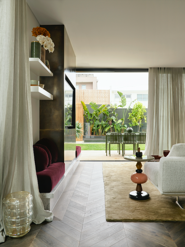
Shona McElroy has always loved the idea of reflection that adds a sense of playfulness – and believes it’s a common theme in this house. She adds: ‘I love the idea that the semicircle at the back would mirror the semicircle at the front to create a hole. Take note of how the semicircle on the left completes itself in the reflection and appears as one circle, like an optical illusion.’ The title of the project, Mirror Image, takes inspiration from its residents, conjuring a home of their own desired immersion. The meaning comes from both the use of mirrors and reflective surfaces, and from its mirrored spatial arrangement of its neighbour.
‘The movement in the brass pendant lamp is a piece that I’ve loved for years. It’s essentially made of super fine brass. It’s so thin that it ripples whenever a breeze blows past it; it undulates. It’s amazing – like a fabulous broad brim hat that you’d wear poolside at a resort.’
Shona McElroy’s final comment: ‘I guess the clients wanted the entire vision from, and left it all up to, me because we get along so well; and I understand what they want. It’s not the kind of project that many people would expect to love. But I do. It comes off as, like, maybe loud. But when you’re in, it has so much personality and warmth. And I guess this mishmash of materials feels rich, yet homely.’
In 2017, Shona was working as an architect at a firm and slowly felt more drawn to the interiors. She would divulge this to people in her life and to one of the mother’s whose child she was nannying. They had become really good friends and would spend evenings hanging out together. One evening, after mentioning that she wanted to do up her beautiful 800-sq-metre Victorian house in Hunters Hills, the mother asked Shona if she would do it for her. ‘I really believe that you can do it,’ she said. It was fabulous, went smoothly and they love it. Shona had watched the family so closely while interacting with them, she immediately knew what the house needed to help them navigate their lives more efficiently.
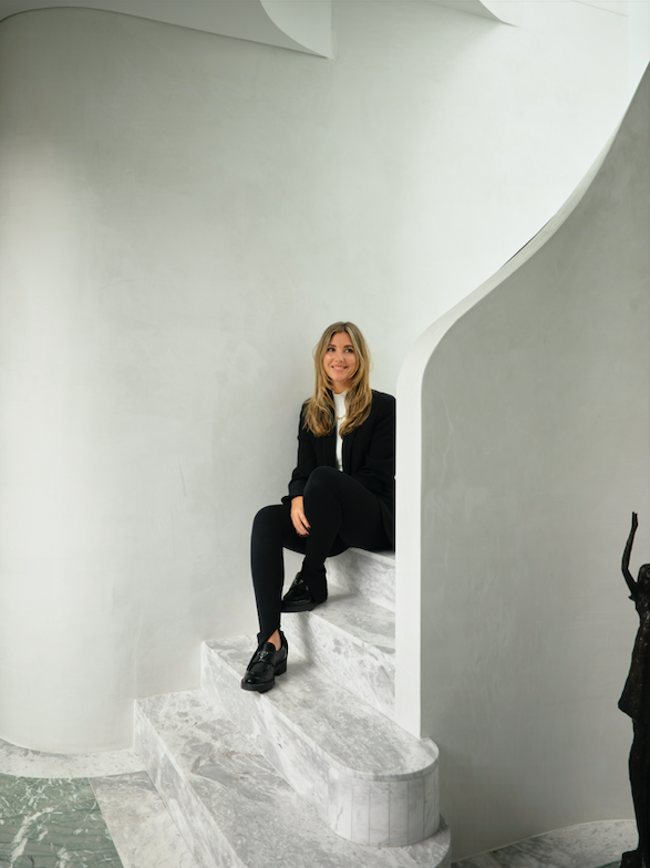
Shona McElroy, principal of Smac Studios
location: Sydney, Australia | architecture: VRM Architects | interior design: SMAC Studios | photographer: Anson Smart | photo stylist: Claire Delmar

